Tuesday, January 4, 2011

Fonts In Use


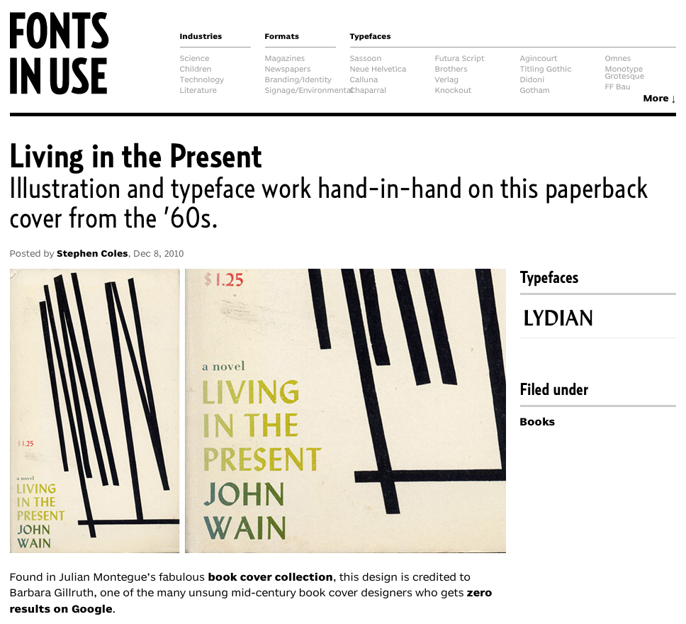
Finally, an answer to the perpetual question, "what is that font?". The new blog, Fonts In Use has a lot of potential to be a great resource for graphic designers, especially for more obscure things like book covers from the 1960's.

Found via designworklife

Saturday, January 1, 2011

Looking Ahead


First day of the new year, 1.1.11, ready to leave 2010 behind. Looking out for new inspiration as "I dwell in possibility..."


Image from Jak+Jil
, quote by Emily Dickinson

Monday, December 20, 2010

Carine


In light of the recent news of Carine Roitfeld's resignation from Editor in Chief post at French Vogue, I thought I would post my favorite cover from her time at the magazine (2000-2010). It features Natalia Vodianova playing the part of the expectant bride, from April 2006. Along with her creative director Fabian Baron, Carine raised the bar for the Vogue enterprise, artistically and stylistically. This type treatment, an elegant serif expressed through italics and all caps has been widely imitated, but this is where it started. It's a perfect example of elegant type placement paired with a stunning cover image.

Sunday, December 12, 2010

Blondie


Ever wonder what you'd look like as a blonde? The artist Alexandra Bircken offers up
a quirky alternative to a blonde wig or hair dye.

Thursday, December 2, 2010

Newness is the Mode


One of the more interesting highlights of my fall was attending the NY Art Book Fair. Unfortunately I was unable to see the whole show due to the large volume of exhibitors, but I got a good taste and was lucky enough to snag a couple of books. One of the books was Lay Flat 02: Meta (pictured above), a photography book edited and produced by the artist Shane Lavalette. It's a book that I will endlessly revisit, to pore over the amazing photography and thought provoking essays, but also to admire as an art object, in and of itself.

Since I'm on this subject of the NY Art Book Fair, I thought I would link to this article written by Rob Giampetro about the fair. It's such an interesting analysis of this moment we're experiencing within the world of books and in the larger sense, print. I found it smart and inspiring. Lately I find myself thinking, "When I look back at this time in history, what defined this moment for graphic designers?" and "What will it look like in retrospect?" Everyone talks about how print is dead or we're on the cusp of a revolution in print (moving to web). But maybe print won't die. Maybe physical, tangible books will always hold value. Regardless of what happens, if in this moment, "newness is the mode", that's okay by me.

Friday, November 26, 2010

Watercolors


Watercolor paint, especially watercolor typography, has been lingering in the back of my mind for about a year and a half. While researching imagery for a campaign at work, I was inspired by the work of Jody Barton (above) and had the big idea that I would illustrate type using watercolor, or commission an illustrator to do so. Due to budget and time restraints I decided to shelf the idea and pursue an alternate course. Fast forward to November 2010 and I discovered more watercolor typography that still has me itching to experiment. Since I've decided 2011 shall be the year of the personal project I might add watercolor type onto my list of things I want to explore. My recent discovery was the work of Sasha Prood, an illustrator and designer living in Brooklyn. I was also excited to find out that she designs graphics for J.Crew, considering I've been drooling over their graphics, catalog design and photography since high school. It's always nice to know who the behind the scenes talent is.


Getting back to watercolor, I'm really fascinated by the precision these illustrators have achieved in their work. A few months ago I bought watercolor masking fluid, to help refine my method of application, but I was so turned off by the toxic fumes I put it away and haven't re-opened it in months. I was convinced that Jody Barton was using some tool, like masking fluid, to keep his paint from running. But after seeing this image below from his website, I'm not so sure! This is obviously a matter that requires further investigation and experimentation!


Tuesday, November 23, 2010

Feather Lust


I think what I like about these ornaments is that they don't scream Christmas and they can hang as a decoration year round; for that reason I can give them to friends who don't celebrate Christmas. The juxtaposition of feather on glass just enhances the delicate quality of the ornament.